|
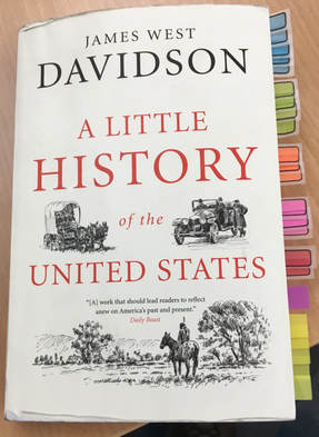
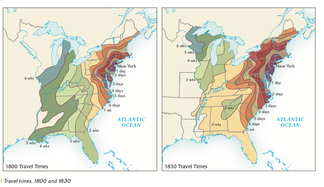
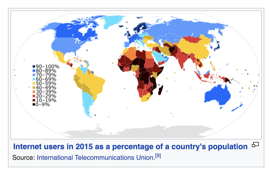
I had an enjoyable visit recently to the Princeton Day School, whose sophomores are reading A Little History of the United States. (More on that soon in a future entry.) One student's book caught my eye: her neatly colored tabs calling out key pages in the narrative. Some people respond to color immediately; others seem oblivious to its effects. When first putting together the college American history survey I'm a part of (Experience History; also its shorter version, US: A Narrative History of the Republic, both McGraw-Hill titles) one element I paid close attention to was the coordination of colors used on maps. Too many charts seem to use colors in random fashion: blue for this value, orange for that. But suppose you have a chart for the time it took Americans to travel on a journey starting in New York City during the early years of the Republic. This is how it looks in our text: In theory, you could choose any color for any value here: blue for 6 days, yellow for 5. I've seen plenty of maps done in that haphazard fashion. But the values shown here represent a progression, from shorter to longer trips. The map becomes easier to read if the colors are chosen as a progression too. I asked production to move from hot colors (purple, red, orange, yellow) into cool colors (green, dark green, blue) to connote fast travel (hot) and slow travel (colder). Similarly, in showing which nations of the world are the heaviest Internet users, I came across this map in Wikipedia: It does have a color-coordinated gradation, but to my mind, the gradation is counterintuitive. The heaviest Internet usage here is shown in dark purple, then moving to blue and light blue as usage declines. My guess is that it would make more sense to use "hot" colors like red and orange for the heaviest usage and cold colors for places where the fewest people use the Web. In doing our own map, we started with black as the fewest users ascending to blue, light blue and so on...ending with red as the color for the "hottest," highest percentage of users.
There are complications in achieving this coordination. Graphic designers begin the production process by choosing a "color palette" for the entire book, so that the look and feel of the text is consistent throughout—a good thing. But those restrictions sometimes limit the number of colors available. Bottom line is, being sensitive to color in design makes for better history! There is potentially no limit to how far you can take a sensitivity to color. The most striking example I'm aware of personally, was in the living room bookshelves of the poet Lucie Brock-Broido. She had her books arranged not alphabetically or even by subject matter, but by the color of their spines! It made for a striking appearance in terms of interior decoration...but I'm thinking she had to have a good memory for the colors of specific books, or she would have spent a long time poking around looking for a particular title!
0 Comments
Your comment will be posted after it is approved.
Leave a Reply. |
James West Davidson
Occasional thoughts on history, teaching, paddling and the outdoors Archives
May 2019
Categories
|


 RSS Feed